Client
Urban Gateways: iOS & Android app | Dec 2018 - May 2019
"Founded to address the lack of artistic exposure in Chicago-area schools and provide young adults with free tickets to attend musical recitals."
Problem
The web-based portal our client's members (ages 13-19) use to get tickets is confusing and buggy causing them to miss shows.
Internal team
1x Lead UI/UX Designer, 3x Engineers, 1x Project Manager
Week #1 - Onboard client & comparative analysis
The client team and I met to discuss their business needs, member needs, and goals for the mobile app. We looked at other ticket purchase services to understand how best-in-class experiences were serving their customers. It was helpful to refer to analysis when brainstorming solutions
Comparative analysis
Week #2 - Site maps & user flows
The first week of the project the client team and I met to discuss their business needs, the needs of their members, and their goals for the mobile app. Together, we defined four types of users for the app. Using their existing web-portal, I created a site map and four user flows that incorporated the new features they wanted to add.
Week #3 Research & interviews
I put together a list of resources to learn more about young adults interacting with web and mobile apps. This helped set constraints and gave me and the team a basic understanding of how younger adults interact with digital products.
Young adults think they are web and mobile experts, though their usability test results are lower than average compared to adults. This is mostly due to lower literacy levels, less patience, and lack of experience with research, making them very susceptible to missing key information or details in an interface.
Week #5 Designing key features
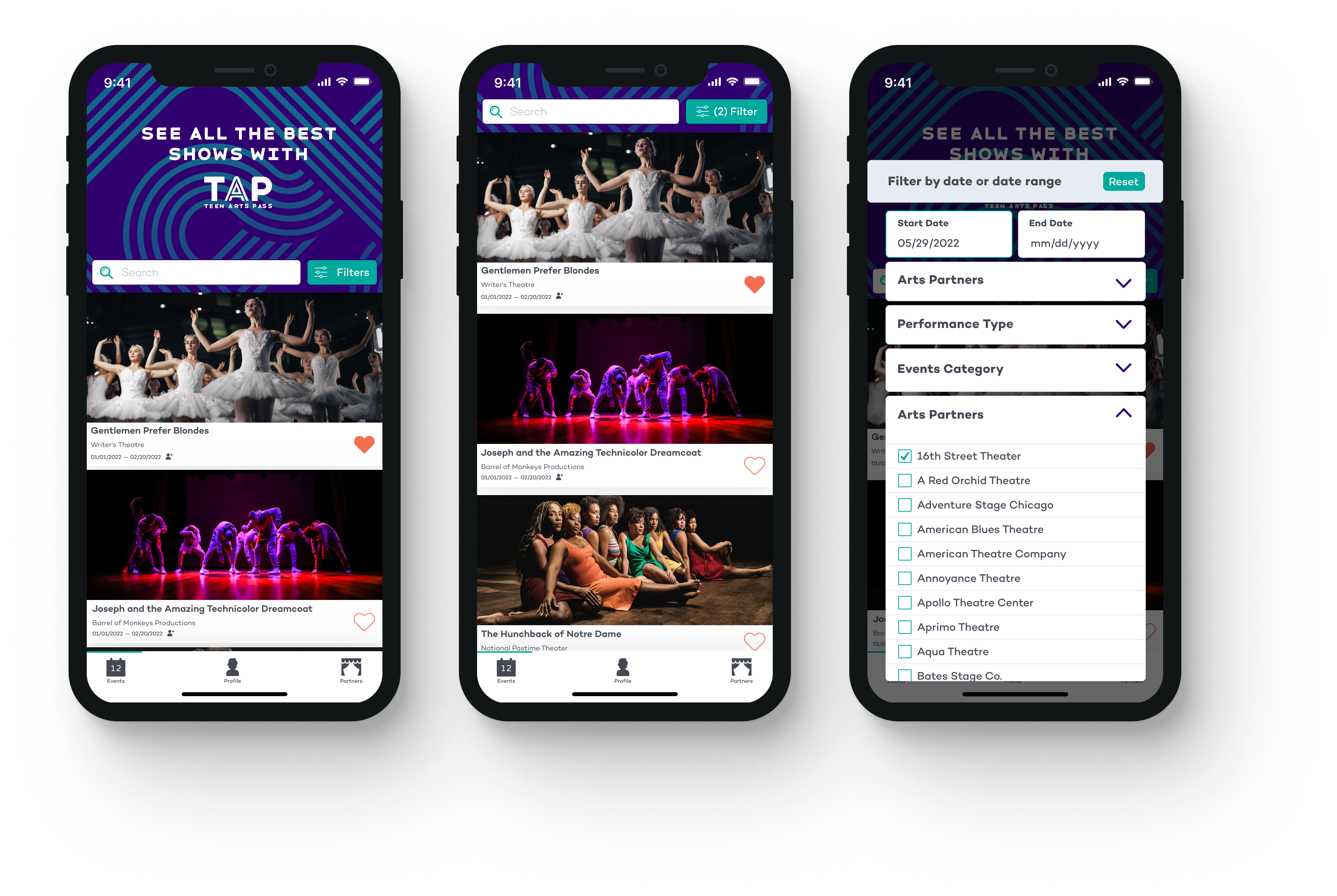
The client wanted the events list feature to be the star of the application and wanted to place the user in the event list immediately after logging in. This was the 2nd most complex feature in the app, pulling in data from Wordpress and allowing young adults to save the events they liked in a favorites list.
The client team was thinking a lot about their users, and they were fixated on account creation as a prerequisite for using the apps features. However, they were open to feedback from our team about keeping the events list feature accessible without having to create an account. I eased their concerns by explaining that we can cut through complexity and provide value up front by prompting users to set up their account in the app after allowing them to browse events and shows.
We also discussed interacting with the events. Initial concepts were liking an event, refreshing the list, viewing the event detail, and changing the order of how the events are listed, filters, etc.
Week #6 User testing
Prototype We had done a lot of work, but we were eager to check in with the members of the program and validate our ideas. The client hosts their bi-weekly teen council meeting that many young adults attend. The client agreed to designate a portion of the meeting to gather feedback on a sprint-by-sprint basis. We used a Google Doc to add questions and collect responses.
1st Round of Feedback
I started reporting the feedback in our stand-ups and summarizing what was recorded by the client.
One insight that we used to support our position on the favorites list came from the group’s feedback. The client felt strongly about using star icons for favoriting an event, while the teens unanimously felt it should be a heart.
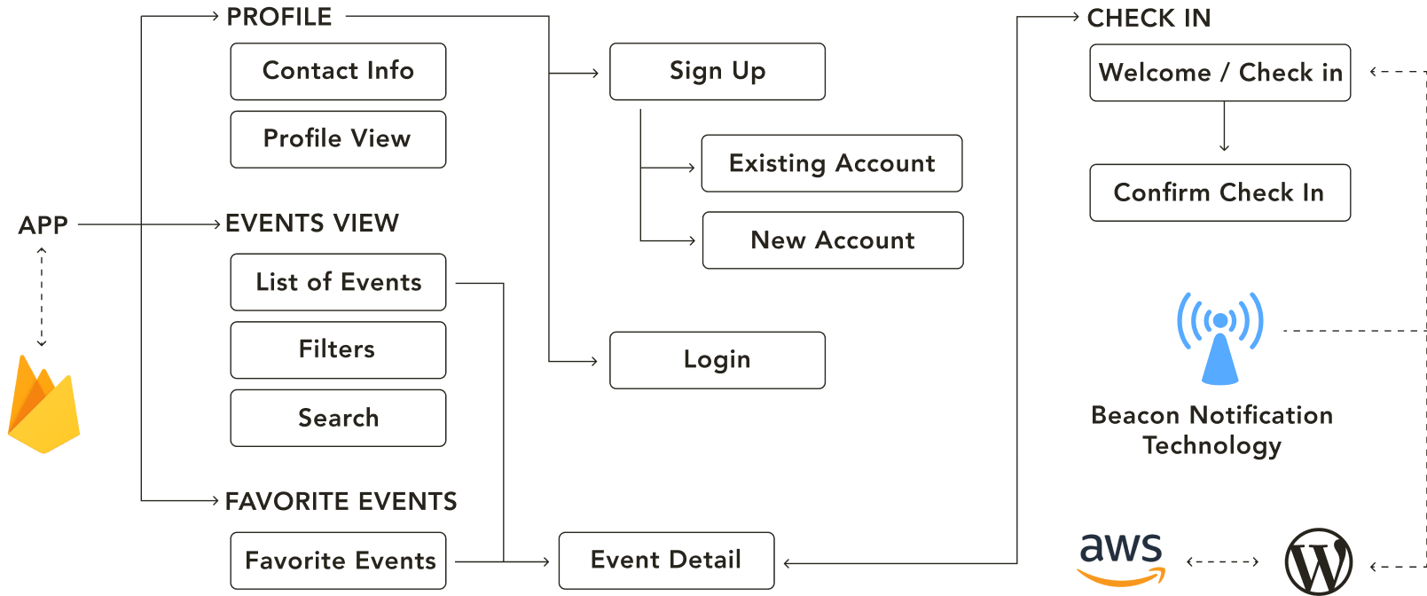
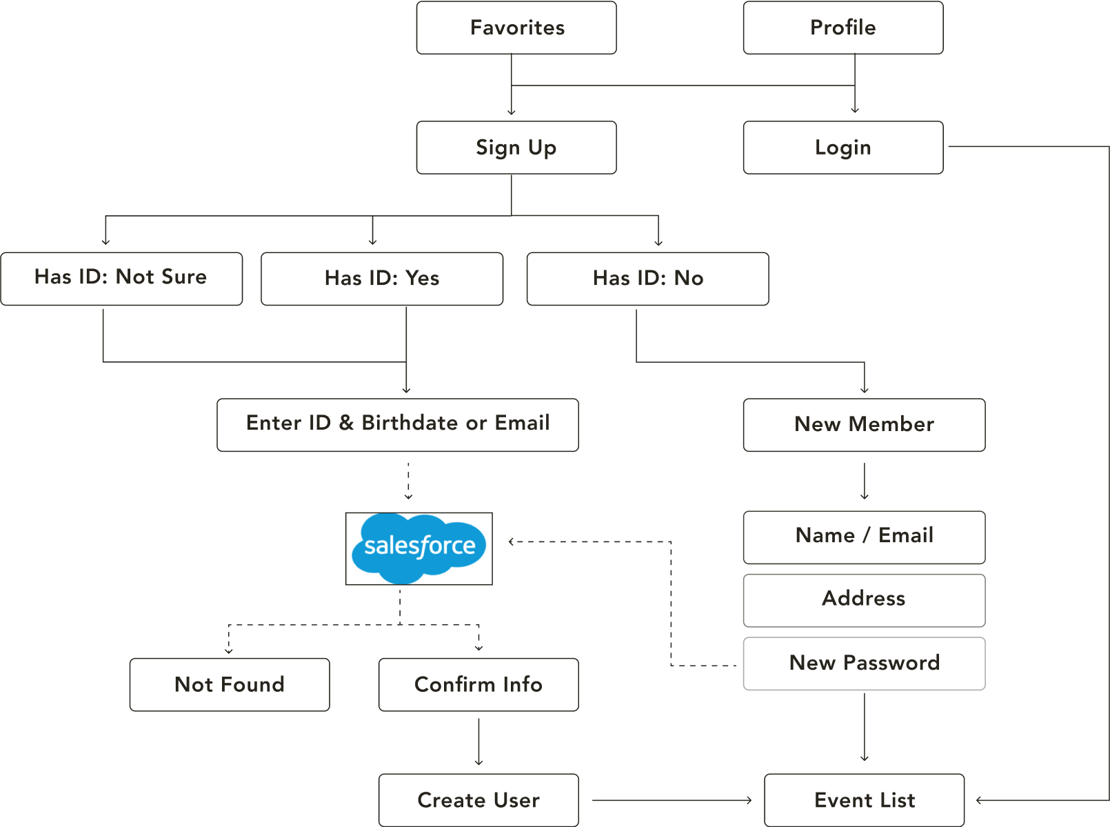
Refining High-Level Concepts
We were able to make a lot of high-level decisions having a map of our features and the back-end layers visualized for the whole team. We ideated this flowchart based on the feedback we collected from the client team using Zeplin, a design handoff tool, to pose questions and generate ideas.
We were able to find direction for:
Decide the events list is accessible without having to log in. Determine technical requirements and specifications for Salesforce and Wordpress. Refine how notifications will work in the user journey. Being able to view the events list without having to log in. Placing the user in the event list immediately after logging in. When to prompt account creation or logging in. Technical requirements and specifications for Salesforce and Wordpress.
What We Know
Young adults have to use a calendar that is overrun with duplicate dates for certain events. Young adults suggested ordering the events list by date, projected popularity or shows they’ve seen before or favorited.
What We Want to Know
Do the teens feel they are getting enough value from the functionality of the events list that we are able to incorporate for version one? Out of all the feedback we received from the teen council members, in order to deliver an MVP, what functionality should we prioritize that improves the experience of finding events compared to the current option?
Hypotheses
The biggest ask from this age group are filling out forms, specifically the user flow for creating an account and following detailed check-in instructions for the shows they book to attended. We will need to ensure those steps have good system feedback, clear language and interactions that guide them so they are able to successfully attend shows, and our client is able to capture accurate data for shows attended by their members.
Sign Up/Sign In Favorites
Understanding Young Adults
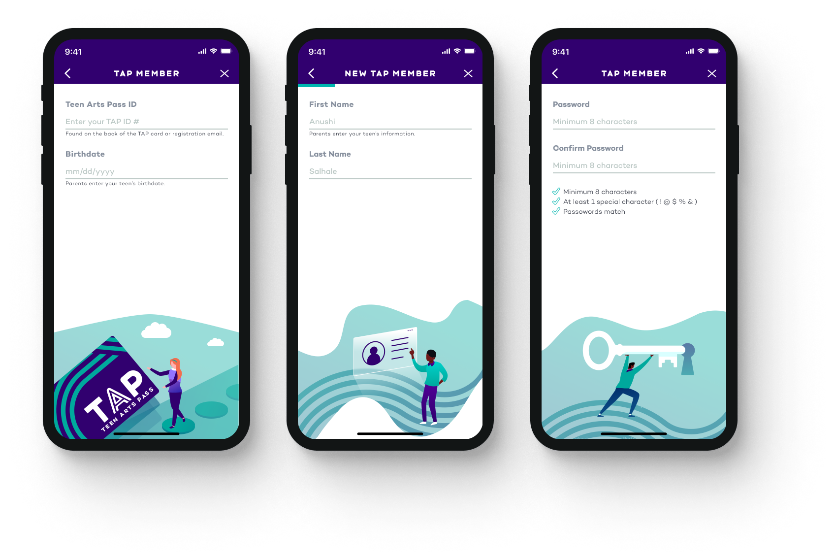
Our team met with the client to discuss requirements for the login and sign up flow. We learned the process of setting up their account on the app is tied to information that already exists in Salesforce.
Our client explained that they intended to register new members of the program with the app and allow existing members to bypass registration and only create an account to login with. We also discussed the possibility of a user who “isn’t sure” if they’re a member of the program. We used Invision's Freehand sketch feature to create the initial flow for new account and sign up.
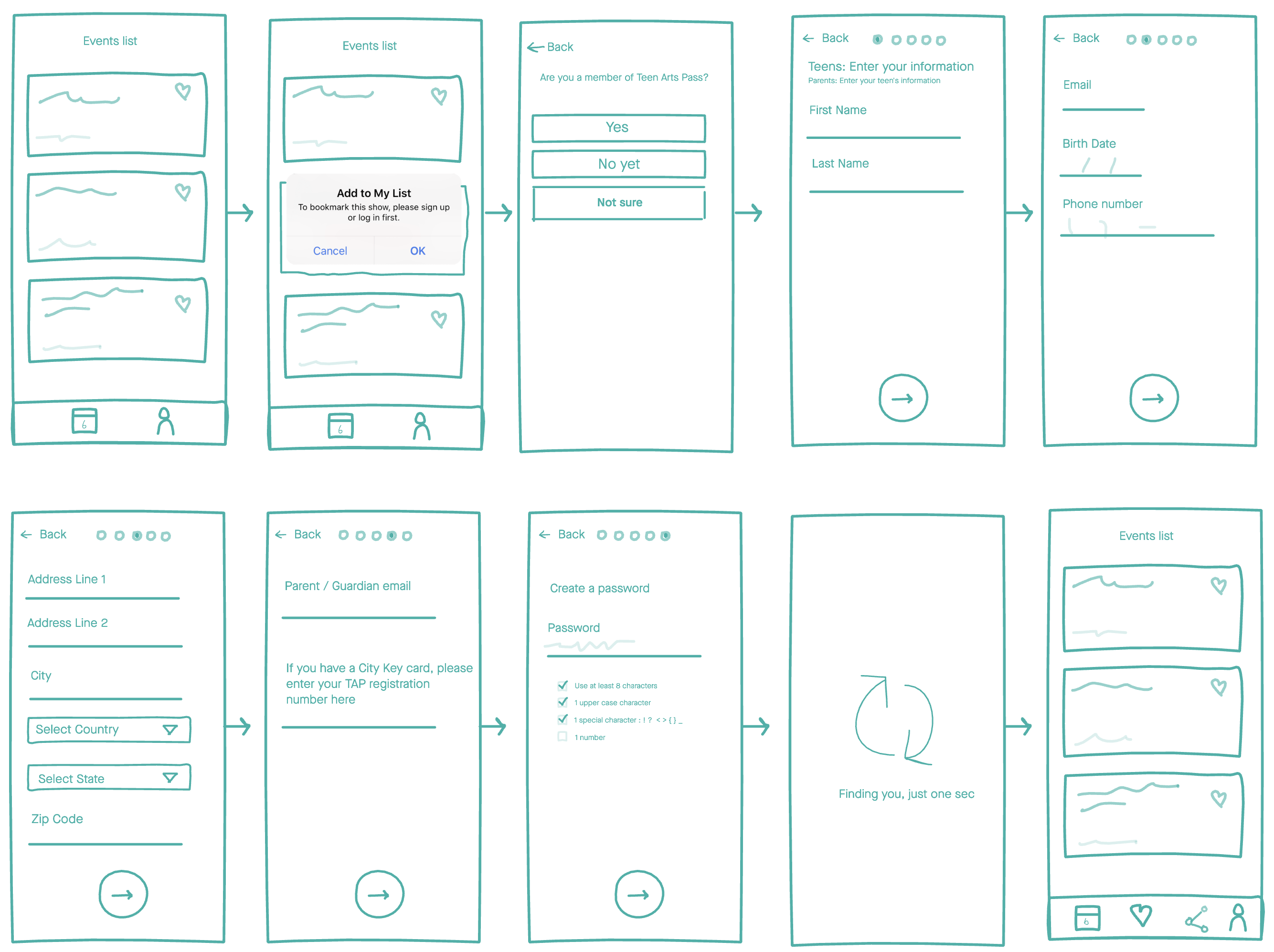
We created a collaborative file for everyone to add their ideas and ask questions about the login flow and test with program members. The client walked everyone through a clickable prototype during their bi-weekly meeting. The young adults felt the initial categorizing of the different member status and app account status’ made sense and the information asked of them was manageable. They asked for emojis to be used generously, particularly in this flow so that it was “more fun”.
The emojis presented a unique challenge. We had to consider the parents/guardians who also enroll their young adults into the program on the young adult’s behalf. We wanted the language to make sense for both age groups, and ensure the emojis used represented the wide range of diversity amongst the members.
The young adults had very specific feedback for language and tone. They liked certain copy, but also spoke up when it wasn’t working, “Sometimes it sounds like you’re trying too hard, like you’re way too excited.”
Delighting The Client And Young Adults
In this project I took inspiration from the client’s lively branding identity and created several illustrations for the app to complement their branding. The client was a bit hesitant about the concept of additional graphic material that was purely aesthetic, but also eager to share the idea with their members. There was overwhelming positive feedback for the illustrations and the client was onboard from then on. The emojis and illustrations gave me a chance to explore social accessibility. In a short time I learned about making inclusive decisions and representing a wider ethnic and social spectrum.
Checking Our Assumptions
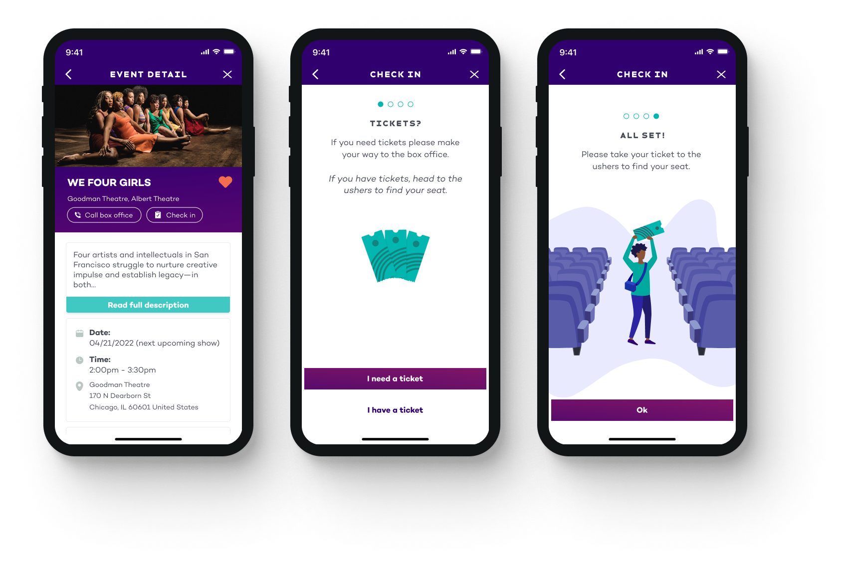
The event detail is the in-depth view of a specific event. The client’s current web version of the event detail does not have any hierarchy or structure for the information about the show. Our client felt condensing everything down to mobile was a daunting task. We started by asking the teens which information they wanted to prioritize. I broke the information into sections and worked with the client to keep each section lean, only including the most vital information. The teens prioritized everything with visual mock-ups. We wanted them to be able to pick and choose what appeared above the fold while taking into account mobile device variances.
We went through several iterations of the design for this screen. I worked closely with the client to ensure very specific questions were asked during group meetings with the teens. I was not familiar with their experience with the theater box offices, so this was a chance for me and the client to collect insights for the event details’ functionality. One of the biggest insights gained was the teens’ underwhelmed response to a calendar to interact with for show dates. I was so sure they were going to be thrilled to have one in the event detail to browse show dates with.
The scrum master kept me and the client honest; the calendar was a difficult feature and I hadn’t offered any other option. I simplified the calendar to show a list of show dates with the full run of the show. Turns out this is what the teens actually wanted, explaining that it was “just faster”. Remembering this assumption has given me a new perspective for subsequent projects: when it comes to complex features, ensure that the end-users are directly consulted because they may not want the fanciest version.
We were able to find direction for:
I always try to find a way to add extra value for the client. In this project I took inspiration from the client’s lively branding identity and created several illustrations for the app to complement their branding. The client was a bit hesitant about the concept of additional graphic material that was purely aesthetic, but also not reluctant to share the idea with the teens. There was overwhelming positive feedback for the “avatars”, and the client was onboard from then on. The emojis and illustrations gave me a chance to explore social accessibility. In a short time I learned about making inclusive decisions and representing a wider ethnic and social spectrum. I now have a new breadth of knowledge for the social sciences in UX that I didn’t before.
The most significant experience divergence from the members’ typical routine was the addition of checking in with the app. The client and I found this challenging since the collection of data about shows the teens attended was purely a business benefit. There would be no way for us to control if the teens who purchased tickets online checked themselves in and bypassed the box office. Our team and the client discussed options to balance the logistics, arriving at a set of rules that would cover most situations, but were also forgiving.