Intro
This project was a strategy engagement with a client in the healthcare industry. We presented a holistic view of the client's current market position within the healthcare industry, captured internal feedback, assessed business needs, discovered gaps, conducted patient research, ran remote co-creation workshops with 90+ stakeholders, prepared a competitive analysis, created a concept blueprint, a high-fidelity clickable prototype, and defined a product vision and strategy, all within 12 weeks.
Problem
Lack of cohesion and digital services at every stage in the patient consumer journey across three companies, each with their own brand presence, patient populations, needs, and divisions.
Work Covered & Teams
Jan 2021 - March 12 Weeks
This project example covers the design work for the strategy phase.
Our team: Delivery Executive, 3x Digital Health Experience SMEs, Product Lead, Delivery Lead, Design Dir., Health Strategist, Service Designer, Interaction Designer, Design Lead, 2x Experience Designers, Business Analyst, Technology Architect
Client team: Sr. VP Digital & Human Experience, System VP Digital Human Experience, Dir. of Product Engineering, Digital Program Manager, Product Manager
Client Background
Largest non-profit healthcare system by revenue in the United States. Headquartered in Chicago, IL, dedicated to providing compassionate, high-quality, and affordable patient-centered care with special attention to the disenfranchised and underserved, in partnership with the communities it serves.
Client Goals
Increase patient acquisition, retention, and improve margins by creating a unified patient engagement platform that transcends systems, organizational boundaries, and houses multiple end to end experiences in one, unified flagship service.
High Level Consumer Experience Journey
This visual represents how patients think of their care management outside of the current app experience. We used this as the guiding light for our research and initial concepts, keeping in mind the unmet patient needs that lay outside the existing landscape of features so that we can design an experience that supports patients holistically.

Opportunities & Visioning Phase
Weeks 1-4
Define a digital product strategy to meet human needs in an evolving competitive landscape.
Interviews & Research
Our interaction design team conducted interviews with 12 stakeholders across different branches of the business and from all three sister companies. The experience designers were not a part of this effort, but used the documented findings to inform our work.
The client’s in-house design team is one UX designer, a design lead, a researcher, and several contract designers. We were given access to the team’s UserZoom account, where we had access to research and study examples with findings from patients across all 142 hospitals.
Main outputs:
The experience designers and business analyst were responsible for the UX/UI audit, the competitive analysis, and differentiation analysis.
Secondary outputs:
Co-facilitated stakeholder workshops under the guidance of the interaction designer and the service designer.
UX/UI Audit
Week 1-2
Audit 9 of the client’s current digital patient experiences.
What we did:
Used a Mural board to document all of our work. We evaluated the existing mobile & web services to understand the current landscape of offerings, identified digital properties most relevant to patient experience, documented features across digital services, and identified issues and areas for opportunities.
Approach:
We cataloged features across the client’s digital services and identified pain points based on 7 principles: utility, clarity, contextuality, predictability, efficiency, flexibility, and accessibility.
We also applied a severity rating to the experiences we evaluated. High severity if the user is unable to achieve their goal, medium severity if it is difficult for the user to achieve their goal, and low severity if there are minor things that could be improved to increase efficiency.
Findings Example
Difficulty Finding a Provider for Care Issue severity: High (unable to achieve goal).
Overall Findings
Inconsistent experience across app and web (sometimes part of booking flow, separate or both).
Web filters have complex UI and do not accurately update results, at times, app filters are not available when searching for a provider within your care team, online booking filters on app and web don’t update results properly, and user lacks context to complete task without progress bar and confusing page headings.
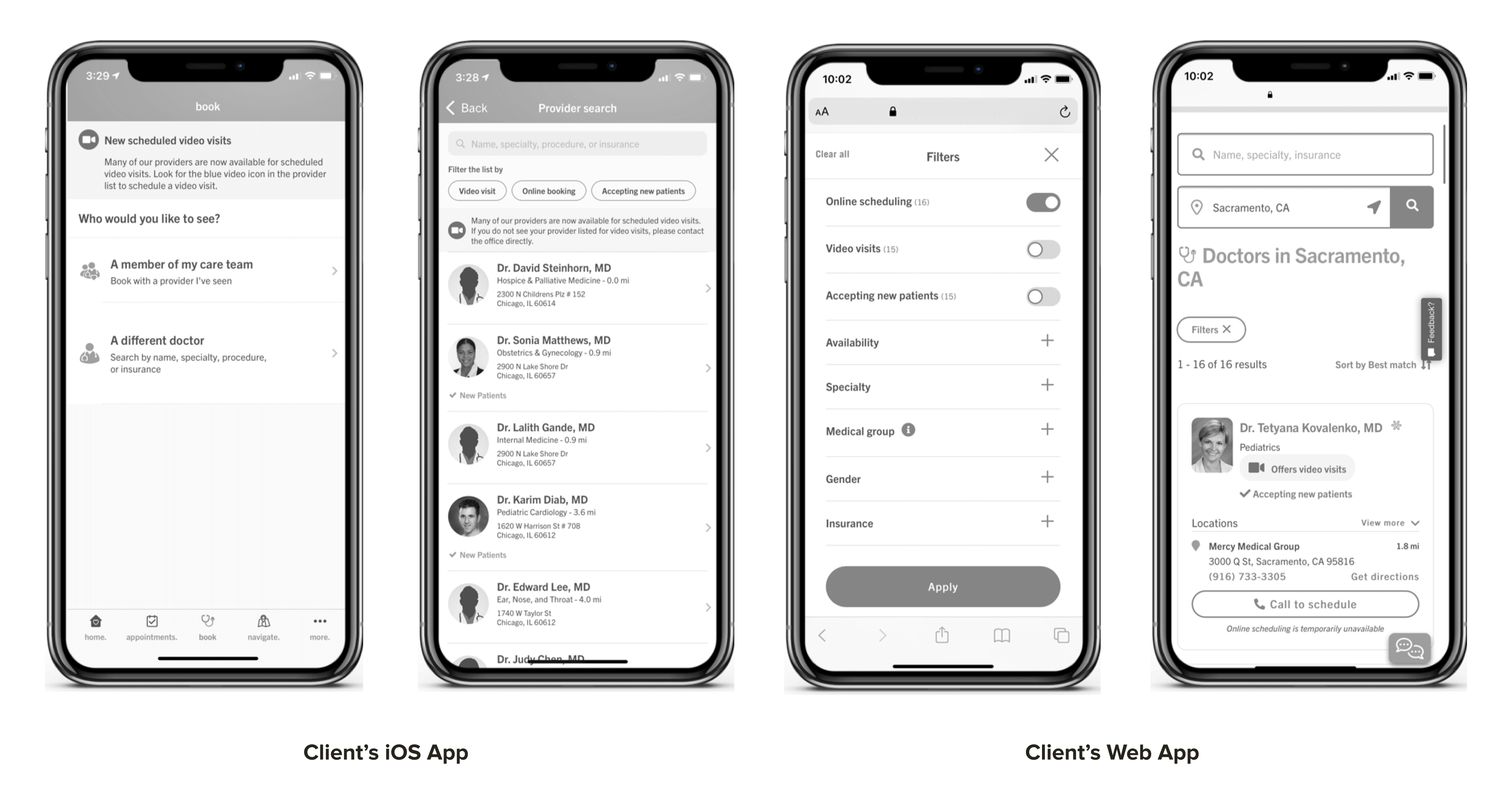
Experience Pain Points
Predictability: Users expect to interact with filters in a simple way and have the option to use filters in any provider search.
Contextuality: The lack of progress bar, clear outline of steps up front and the changing page headings make it difficult for the user to understand where they are and what they’re doing.
Competitive Analysis
Week 1-2
Evaluate the current digital landscape of our client and competitors.
What we did
Used a Mural board to document all of our work. We completed the assessment for our client and 7 competitors: OneMedical, Ascension, Kaiser Permanente, Sutter Health, Houston Methodist, Memorial Hermann, and Mayo Clinic.
Why It’s Useful
This activity allowed us to identify opportunities relative to best-in-class experiences and identify new features to explore for future state experience.
In-App Scheduling Service Analysis
Client: We found that the current scheduling service does not make all providers(doctors) available to book online through iOS and web app.
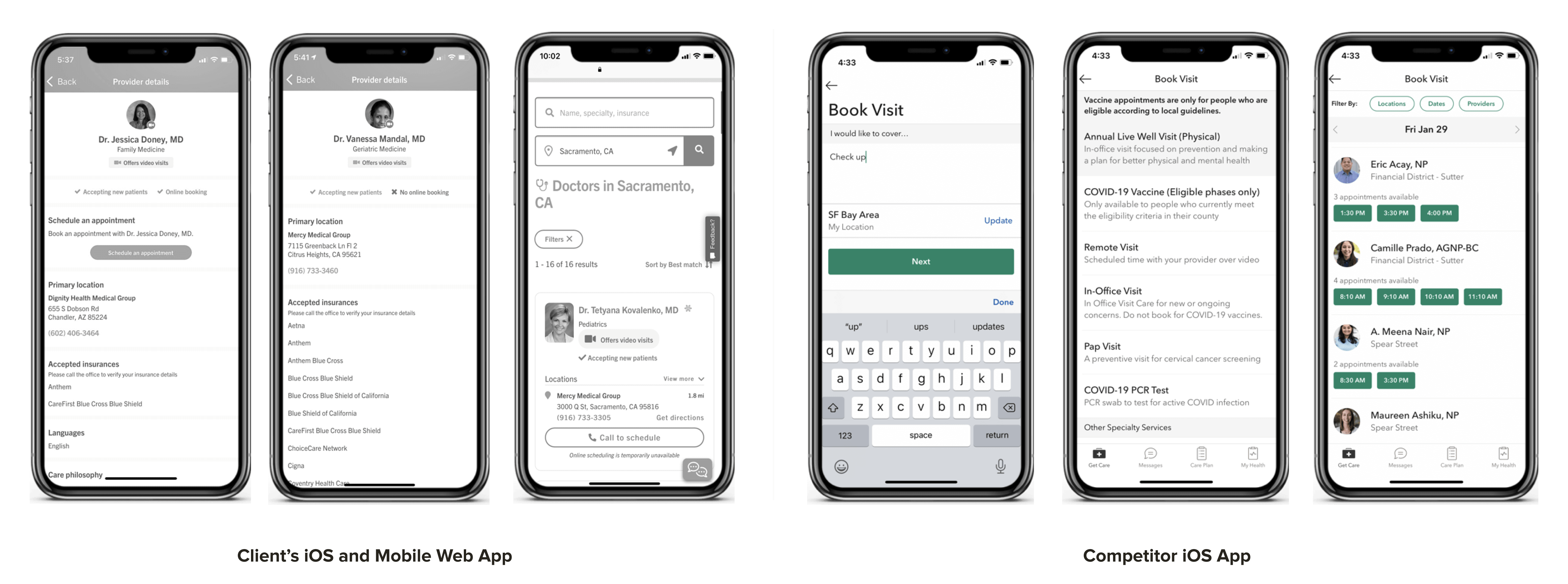
Competitor: exemplifies a digital concierge experience which provides readily available appointments and services, with the ability to view real-time, daily availability for doctors and book directly from the app.
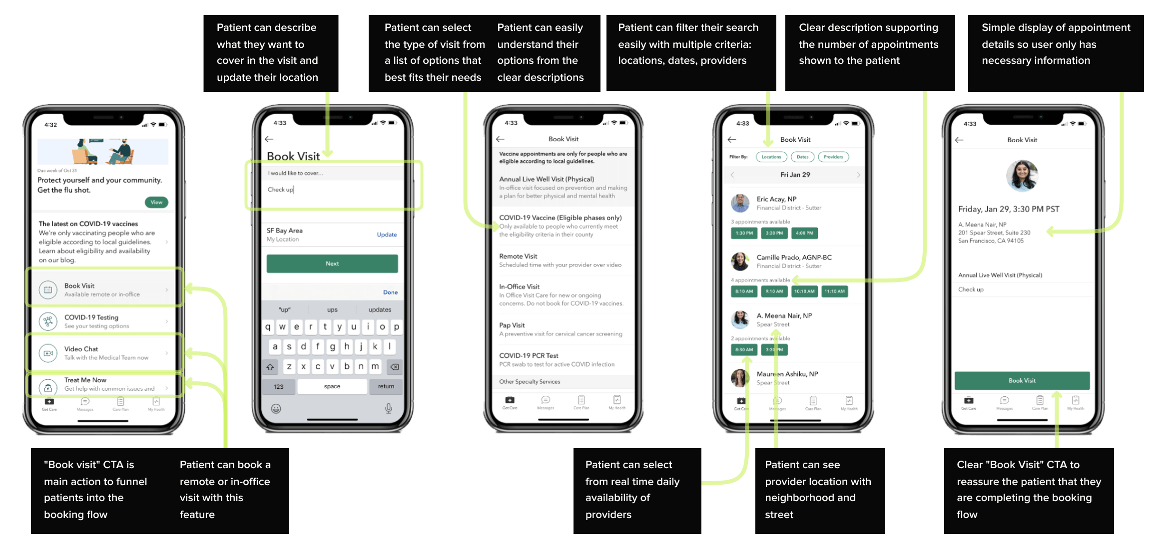
Key Takeaways
The Patient can complete the booking flow in 4 easy steps. Appointment selection allows for quick filtering and real time appointment scheduling. The visual treatment makes it clear what actions will progress the Patient through the flow. Clear indication of where the user is within the flow allows for easy navigation forward or back.
Differentiation Analysis
Week 3
We split our focus during the 3rd week across several priorities. The differentiation analysis bundled the UI/UX audit and the competitive analysis, and the business strategy team’s work from week 1 and 2 into one, final presentation. We spent the week pulling together information from our Mural boards and notes and translated them into slides. We also began preparing for the workshops for the following week.
The interaction and service designers created a list of proposed features. They asked us to take the outline’s they created and add to them. We re-wrote the feature summaries with our input and returned it to them.
Meanwhile we helped prepare the Mural files for the workshops, created a workshop pre-read for our client, and conducted rehearsals for the workshops.
Workshops
Week 4
An in-depth look at the competitive and comparative landscapes, make recommendations, identify opportunities to drive consumer experience differentiation that will generate value for the business and customers, including external partnership opportunities.
Working under the direction of our service design team, we moderated breakout sessions and captured output from over 67 stakeholders across the company.
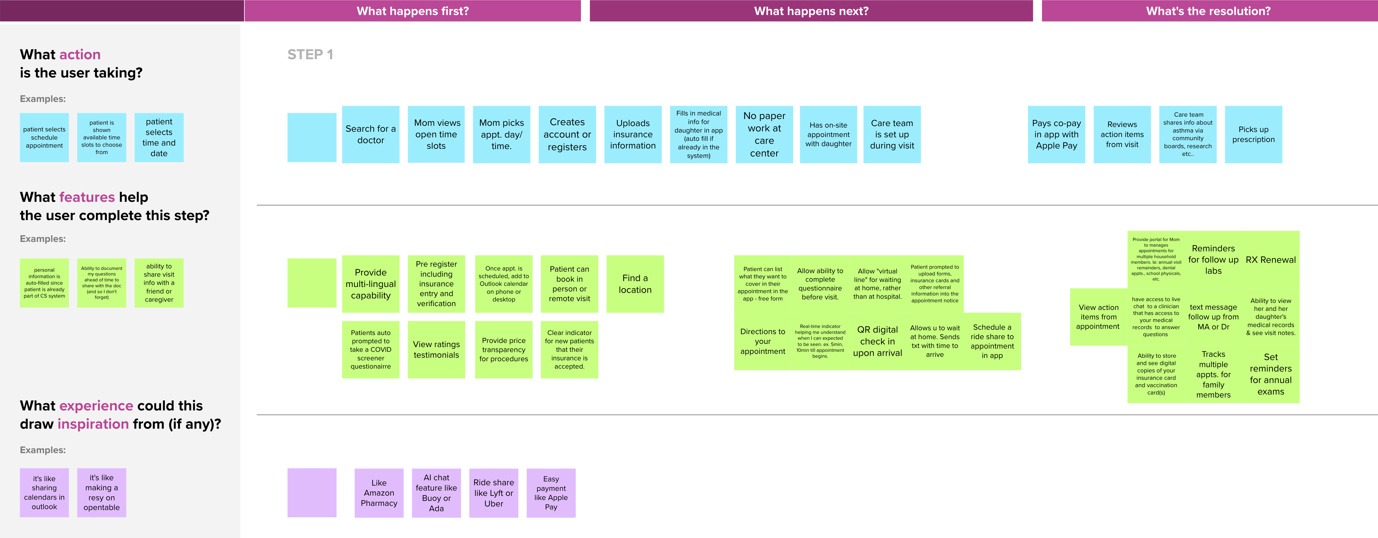
Our third day of client workshops focused on brainstorming experience considerations for a specific opportunity. We captured everyone's input, outlined the steps of the patient journey for the epic, and shared the output of our work in the form of a story to the whole group.
Opportunity:
Self Service for Win Win
How might we allow patients to get self-service answers to their non-urgent questions?
How might we frontload, simplify or automate administrative duties in order to maximize the value of patients’ time?
Each designer was paired with a healthcare expert. The designers managed all of the content created by the client in the workshop sessions and, synthesized all of the feedback. We also helped guide and inspire the team, filling in gaps for the session leaders who were subject experts, but many have never done a virtual workshop before.
Clickable Prototype
Weeks 5-12
Crafting a near-term product experience grounded in needs and expectations of patients.
Main outputs:
60 screen clickable prototype.
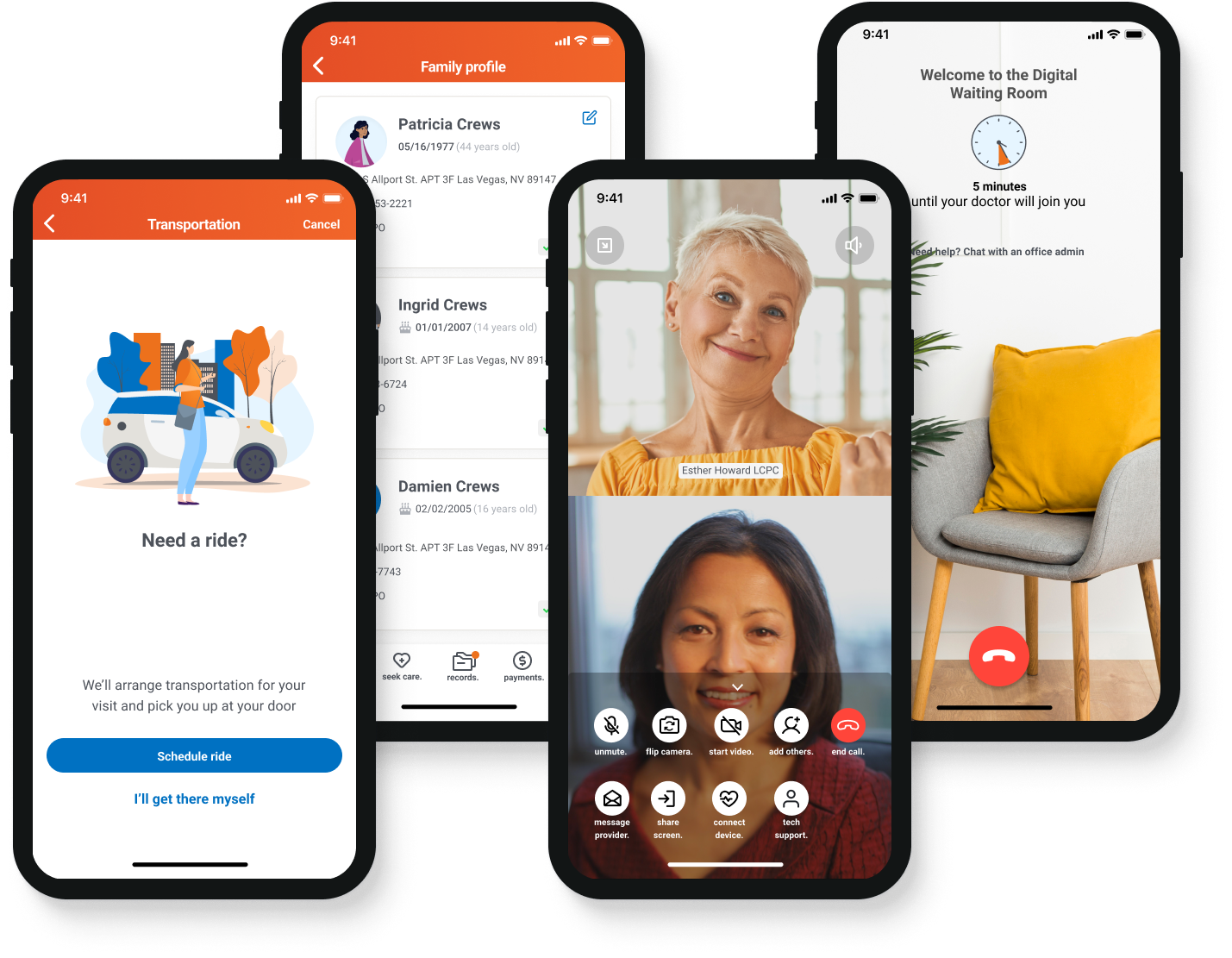
One of the biggest highlights of the strategy engagement was the clickable prototype. The design team poured through countless examples of healthcare industry specific examples and previous work shared by our team's digital health experience experts. We wanted the prototype to tell a story, so we created a persona, “Patricia”, to help us ground the experience and narrow the journey. Our initial wireframes helped ground our story line and give our team and client the basic visuals needed to begin iterating on.
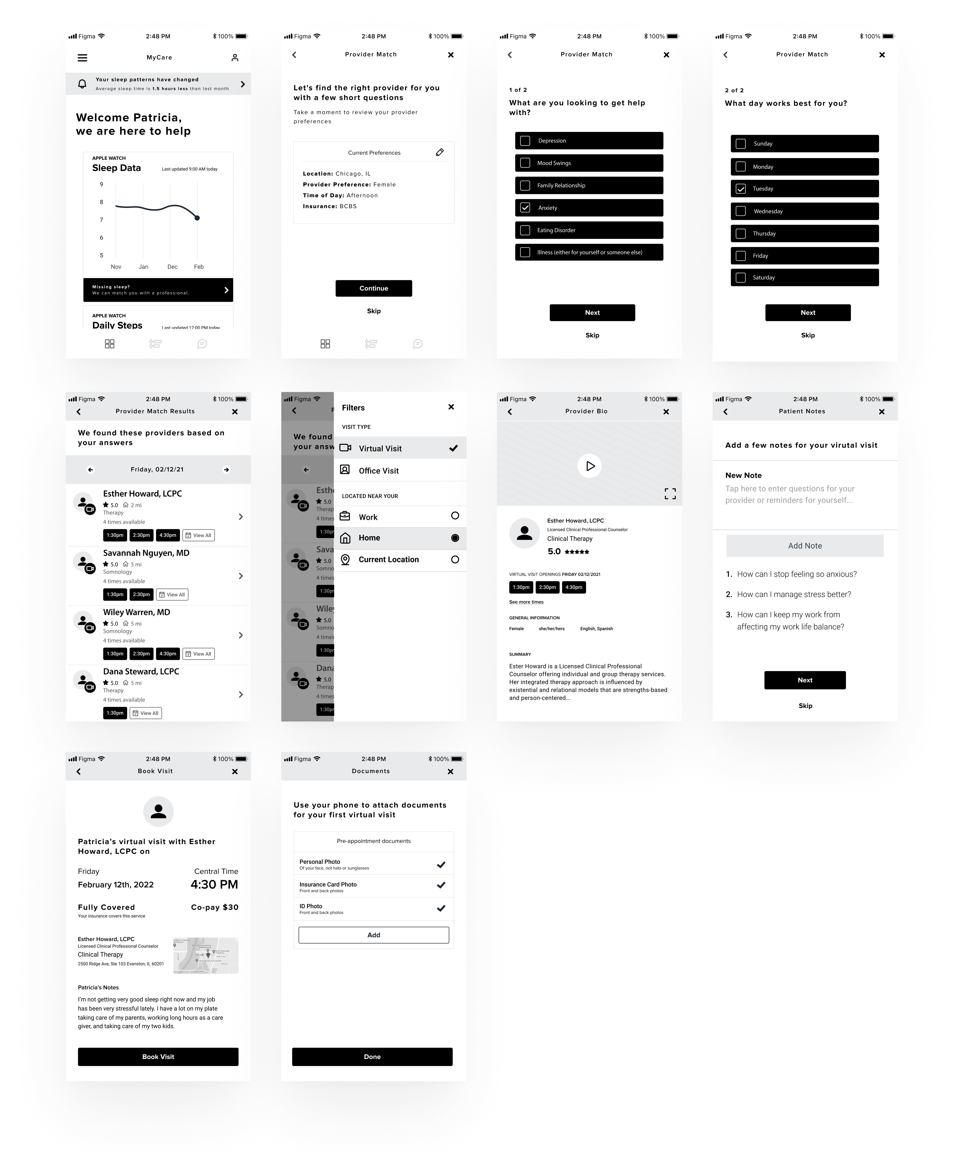
We originally only had four weeks to synthesize all of the output from the co-create workshops and present the prototype at the end of February.
Our client’s primary design tool was Figma, but none of the designers on our team were familiar with the tool except me. We needed to work quickly over the course of two weeks to build more than thirty screens. As a team, we felt I should focus on high fidelity designs, while our other designer focused their time learning the foundational aspects of the tool, and with some guidance was able to create a small (but mighty) design system for our prototype.
Letting our other designer focus on learning only a few key parts of the tool made them feel confident when they needed to update the screens I had created. In the short time we had, we were able to deliver higher fidelity work with more detail than our team expected. Our design lead presented the work, and told the story of Patricia, a mother of two, who was starting to suffer from loss of sleep from working a full time job and caring for her elderly parents.
Booking Transportation Flow
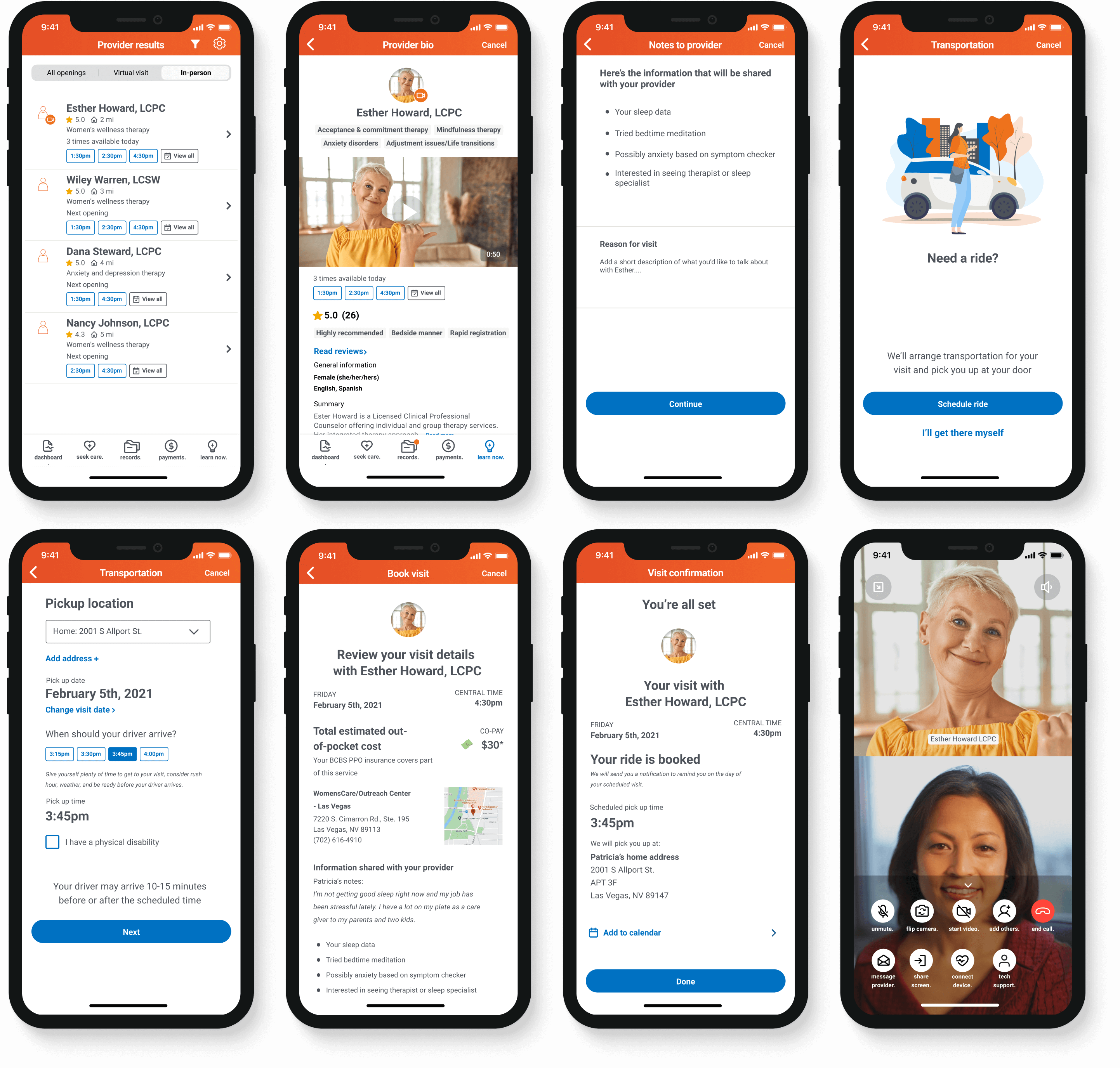
Our client and internal team were impressed that we were able to create so much in a short time, and at a level of quality they had not seen before. As a result the project was extended an additional three weeks to focus on more work for the prototype.
